
White Weddings Are (Always) In Fashion
Pantone Unveils Cloud Dancer, a luxe off-white as 2026 Colour of the Year — a bold move for what some are calling a 'non-colour'.
Every December, the design world holds its breath as the world’s colour authority, Pantone, reveals its Color of the Year. Their choice defines a colour that influences everything from fashion and interiors to beauty trends and weddings.
Pantone unveils their 2026 Colour of the Year ‘Cloud Dancer‘ — a whisper-soft white, bringing a touch of tranquility and peace to our beautifully noisy world.
We have to admit that we were surprised (and it seems the design community is very underwhelmed) by Pantone’s choice Cloud Dancer. If you haven’t seen it yet, it’s basically off-white (a non-colour). In the 26 years Pantone has been choosing a colour of the year, they have never chosen white, so it’s proving a little controversial.
Officially, Pantone’s team said they chose Cloud Dancer because it “encourages true relaxation and focus, allowing the mind to wander and creativity to breathe, making room for innovation.”
While reactions have been mixed, plenty are enjoying Cloud Dancer for its simplicity and softness, and its ability to act as a blank canvas.
We can definitely work with it. If there’s one thing we know how to do, it’s make your wedding day memories feel luxe and elevated.
Pantone's 2026 Colour Of The Year 'Cloud Dancer' is a whisper-soft white that will bring gentle and calm vibes to your white wedding aesthetic.


Why Cloud Dancer?
Pantone’s color team chose Cloud Dancer because, frankly, the world is exhausted.
“We’re looking for respite, looking for relief, emotional disconnection, overstimulation from visuals,”
says Laurie Pressman, Vice President of the Pantone Color Institute.
Re-discovering White As A Colour
Here at The Coffee Table Book we are all about slow living and pressing pause to enjoy moments. Especially so this year, after losing my father who battled dementia for close to 10 years. We are reminded life is precious and short.
So as my family seek a little less noise in our personal life, and plan to have more time away from social media on weekends and a lot more camping trips, we couldn’t think of a more fitting colour for 2026 than a calm off-white “to rediscover the value of quiet reflection” and “allowing the mind to wander and creativity to breathe“.
Pantone’s choice of Cloud Dancer has certainly has raised some questions. Does it even matter what colour Pantone name as colour of the year? How we think of colour? If anything, it’s a colour (or non-colour which ever side of the fence you sit) that will inspire a fresh outlook and have us rediscovering white as a colour.
Who knew the colour white could be so controversial!
We are 100% here for this peaceful era of airy, serene and thoughtful choices. But it doesn’t seem like everyone is excited with Pantone’s choice calling it bland, even unforgettable and questioning if its even ‘a colour’.
“Pantone’s 2026 Color of the Year isn’t a neon, isn’t a jewel tone, and isn’t even a color many people would call ‘a color’.” — Elle Decor
Home Beautiful even headed their article announcing the colour of the year with “Why is the Pantone Colour of the Year always so disappointing?“. Saying “Colour has been cancelled. Pantone is click-baiting us. The Colour of the Year is… an absence of colour?” and “Pantone announced its Colour of the Year for 2026 which is – wait for it – white. Yes, Cloud Dancer is officially the ‘hot hue’ of the year and honestly… what the fluff?”.
While the Guardian wrote “A minimalist statement or just Pantonedeaf? ‘Cloud Dancer’ shade of white named Pantone’s colour of the year“. “Wait, what? You mean … white? Are they trolling us? Is it even a proper colour.” and “This year’s pick is even more baffling.“. And even going onto say “hopefully they’re cheerfully oblivious about the fact this is not a great time to be pointedly celebrating whiteness“… WHOA! they went there?!. But please go read the write up on Pantone’s 2026 Colour of the Year article and try and figure out for yourself if the author likes/dislikes Cloud Dancer. But, we do know the author won’t be embracing anymore white in her wardrobe because of tomato sauce stains… haha.
“How do you describe the colour of clouds? Milk? A blank page? White is considered a colour by some, but essentially all colour is a range of visible light. It’s one of the colours in my kid’s crayon box so I’m saying YES.” — Guardian
Apparently, Cloud Dancer is the visual answer to that collective burnout. Leatrice Eiseman, Executive Director of the Pantone Color Institute, describes it as “a lofty color that reads like a breath of fresh air,” one that serves as “a symbol of a calming influence in a frenetic society…the value of measured consideration and quiet reflection.”
The pandemic accelerated everything—technology, remote work, constant digital noise—and people are still grappling with what comes next. “Where do we want to be with our lives? We started those questions during COVID. Is this where I want to be? Is this who I want to live with? Is this a type of work I want to do?” Pressman says. “Those questions have become even more critical to where we are today.”
Cloud Dancer plays well with others, isn’t overstimulating, makes a minimalist statement and exudes quiet sophistication.
Who decides colour of the year?
Pantone’s selection process has always been about reading culture like a language. Since 1999, the institute’s international team—or “color anthropologists,” as Pressman calls them—tracked influences from fashion, interiors, art, film, travel, and even geopolitics, distilling it all into one shade that captures the zeitgeist. “This is a global team looking at everything that’s happening in the world,” Pressman explains. The color name is just as critical. “It helps to convey the emotion,” she says. “People instantly have to understand what that message is about.” Cloud Dancer is said to deliver: a name that suggests altitude, lightness, and a vantage point above the chaos.
When used for interiors, Eiseman describes Cloud Dancer as creating spaces “where function and feeling intertwine to build atmospheres of serenity and spaciousness,” with texture doing the heavy lifting—rounded furniture shapes, plush fabrics, spa-like bathrooms, and airy bedrooms that promote unwinding and relaxation. She calls the effect “minimalist, yet not stark,” especially when paired with tactile materials that keep the look from turning clinical.
Fashion, however, captures the full range of what Cloud Dancer can do: Eiseman points to “puffy silhouettes and oversized padding” that wrap the body in warmth while staying light, alongside “diaphanous, floaty and fluid” organzas and chiffons that move with ease. The shade shows up in everything from the ubiquitous white sneaker to what Eiseman describes as “comfortable elegance”—pieces that feel “unhurried, uncomplicated, discreet, understated, and yet at the same time have that freshness attached.”
“Similar to a blank canvas, Cloud Dancer signifies our desire for a fresh start. Peeling away layers of outmoded thinking, we open the door to new approaches,” Pantone said in its announcement.
It is not the first time Pantone has sought to calm the world with its color of the year. Mocha Mousse was chosen for its warmth and harmony in 2025, and 2024’s Peach Fuzz was likewise described as a gentle and nurturing shade.
Cloud Dancer may be the first white ever chosen as the color of the year, however white is an always-popular colour when it comes to weddings. We have no doubt couples will embrace this beautiful soft white with a renewed excitement for their 2026 wedding. White is simple to style — always sophisticated and timeless.
What does colour of the year mean?
It means you will be seeing more celebrities wearing the colour on the red carpet and more brands using it in the upcoming year. It will be used in interiors, fashion and of course weddings.
According to fashion magazine Marie Claire, Cloud Dancer is already a trending tone.
“Usually, stars require a few weeks to integrate the Color of the Year into their regular rotation. Cloud Dancer, on the other hand, is already widely loved by Jennifer Lawrence, Dakota Johnson, and Priyanka Chopra, just to name a few,” Marie Claire reported.
How will colour of the year influence weddings?
We are hopeful this elevated luxe off-white tone inspires some calm in the world, starting with the best celebration of them all — a wedding day, a day that marks the beginning of a marriage of two beautiful souls coming together.
This is the first time in 26 years that Pantone has selected a shade of white as its Color of the Year. “In a world where color has become synonymous with personal expression, this is a shade that can adapt, harmonize, and create contrast, bringing a feeling of airy lightness to all product applications and environments,” the Pantone website explains.
Basically, Pantone has given couples its blessing to get married in 2026. Weddings naturally align with the idea of a fresh start and a blank canvas—exactly the sentiment behind this year’s selection. Beyond the color itself, the name Cloud is significant. It evokes softness and atmosphere: airy, voluminous, playful, romantic, ethereal, weightless, and almost vapor-like. As Pantone notes, Cloud Dancer is “infused with a sense of billowy softness that comes through in the spongy, puffy silhouettes, oversized padding, and rounded shapes…cocoons and envelopes, promoting relaxation and well-being.”
We found those sentiments incredibly aligned with weddings and no doubt will inspire couples to bring this dreamy, cloud-like aesthetic into their 2026 wedding day.
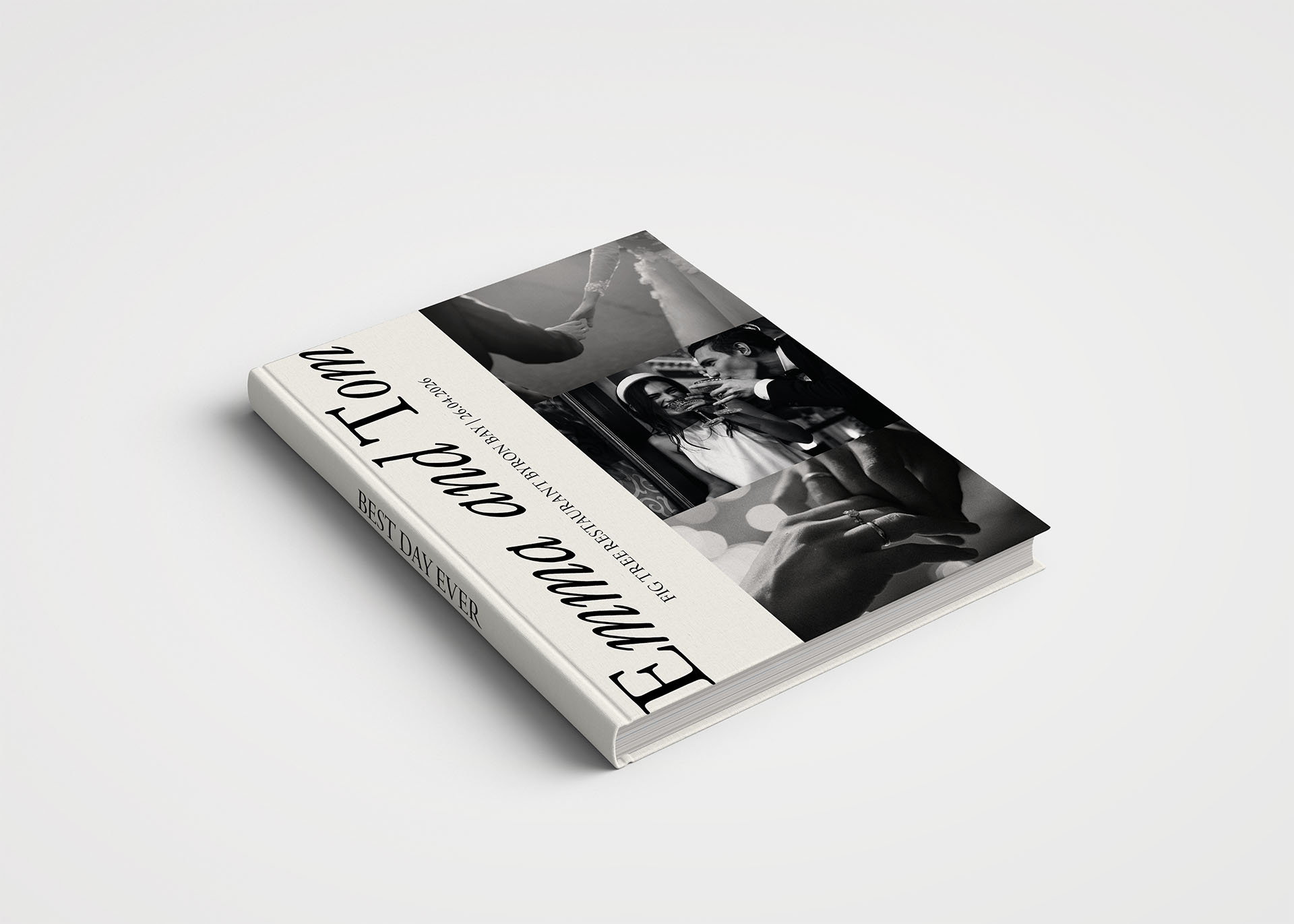
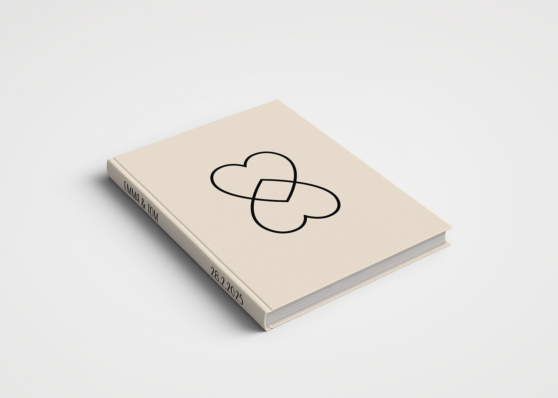
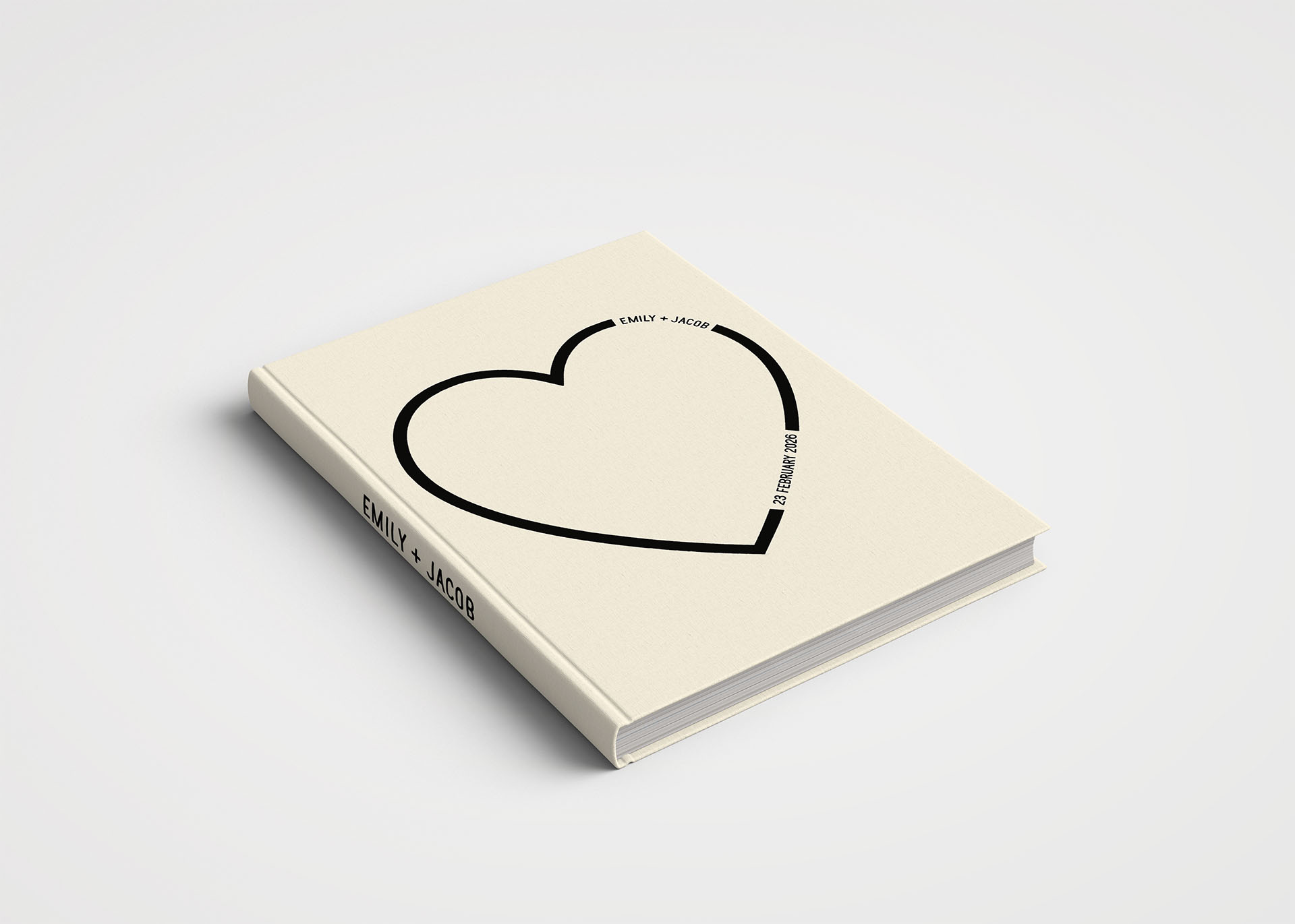
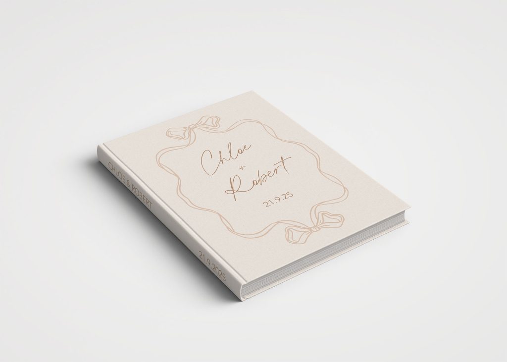
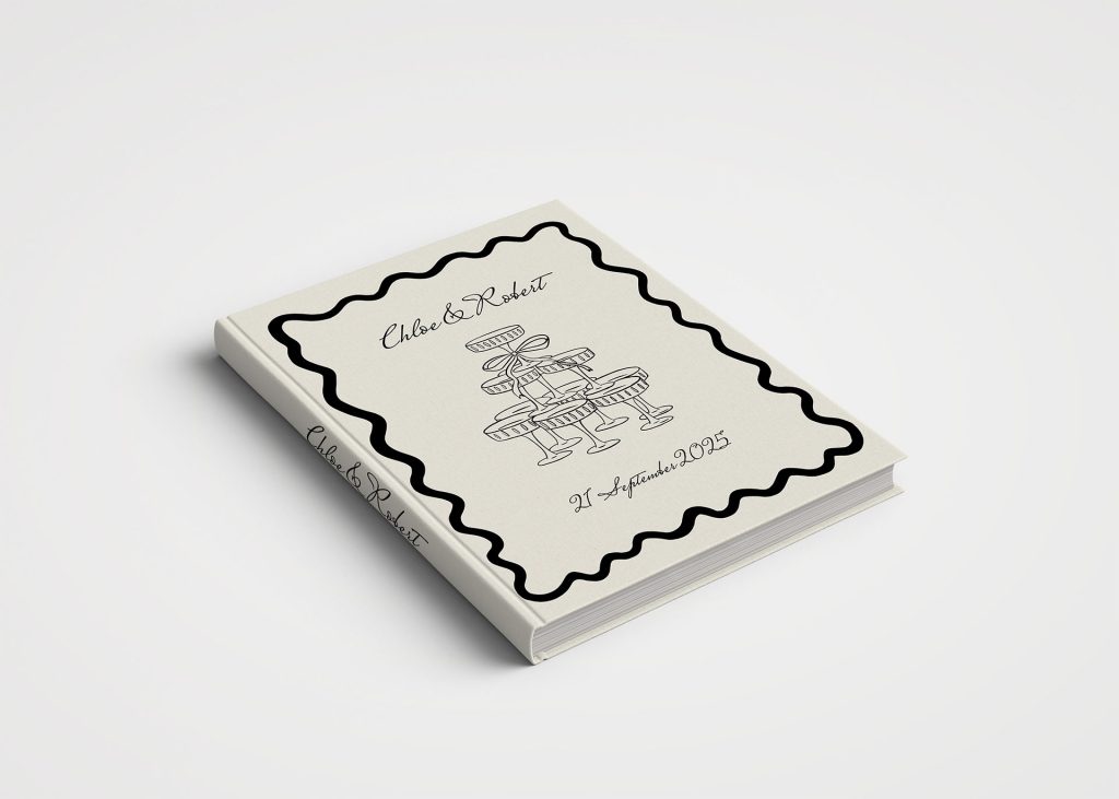
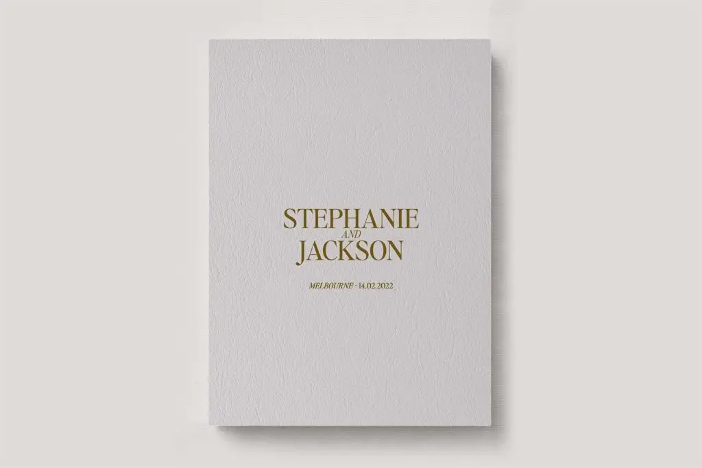
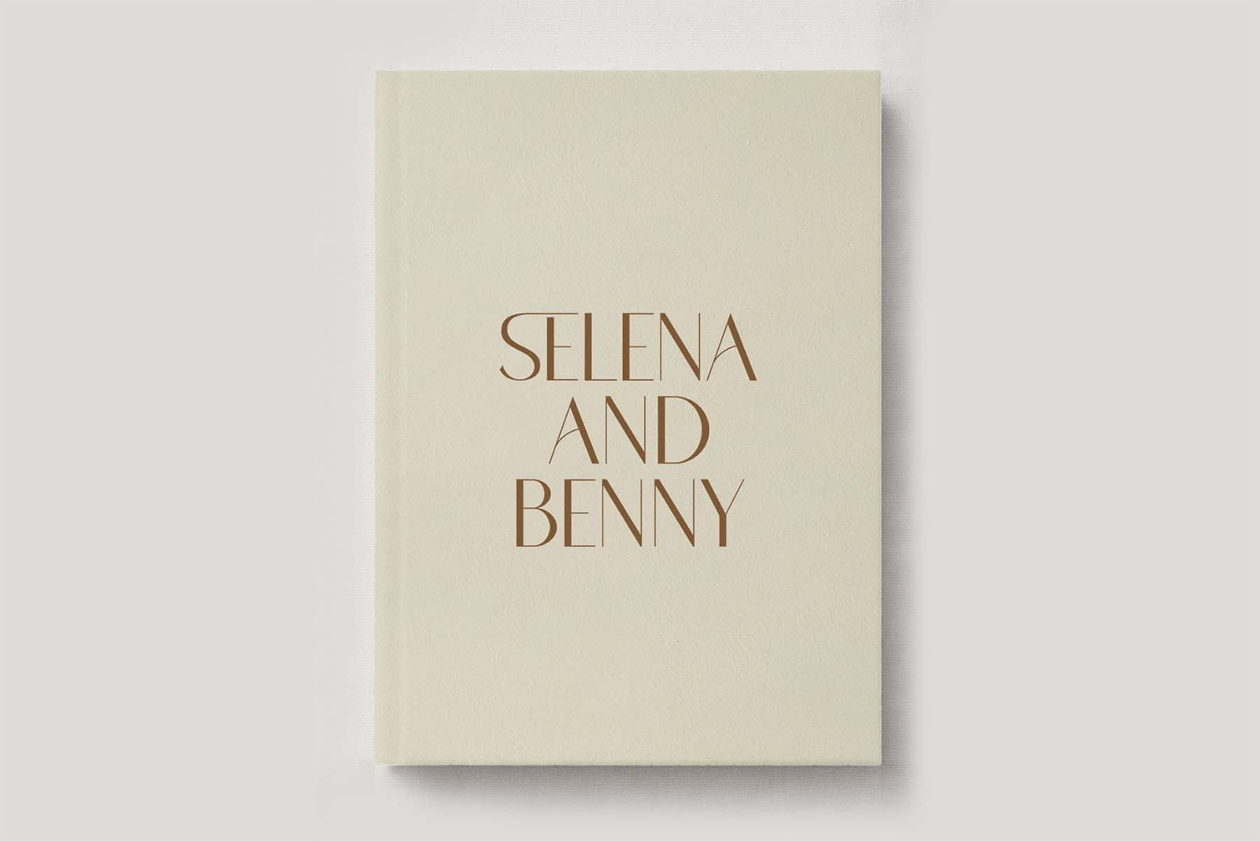
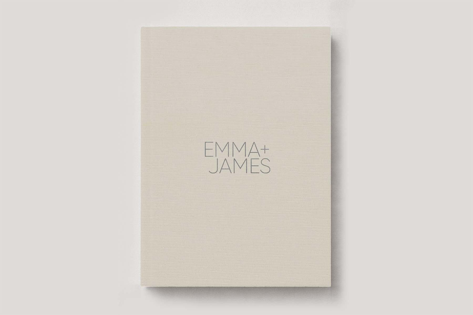
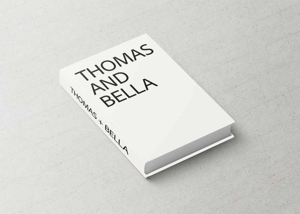
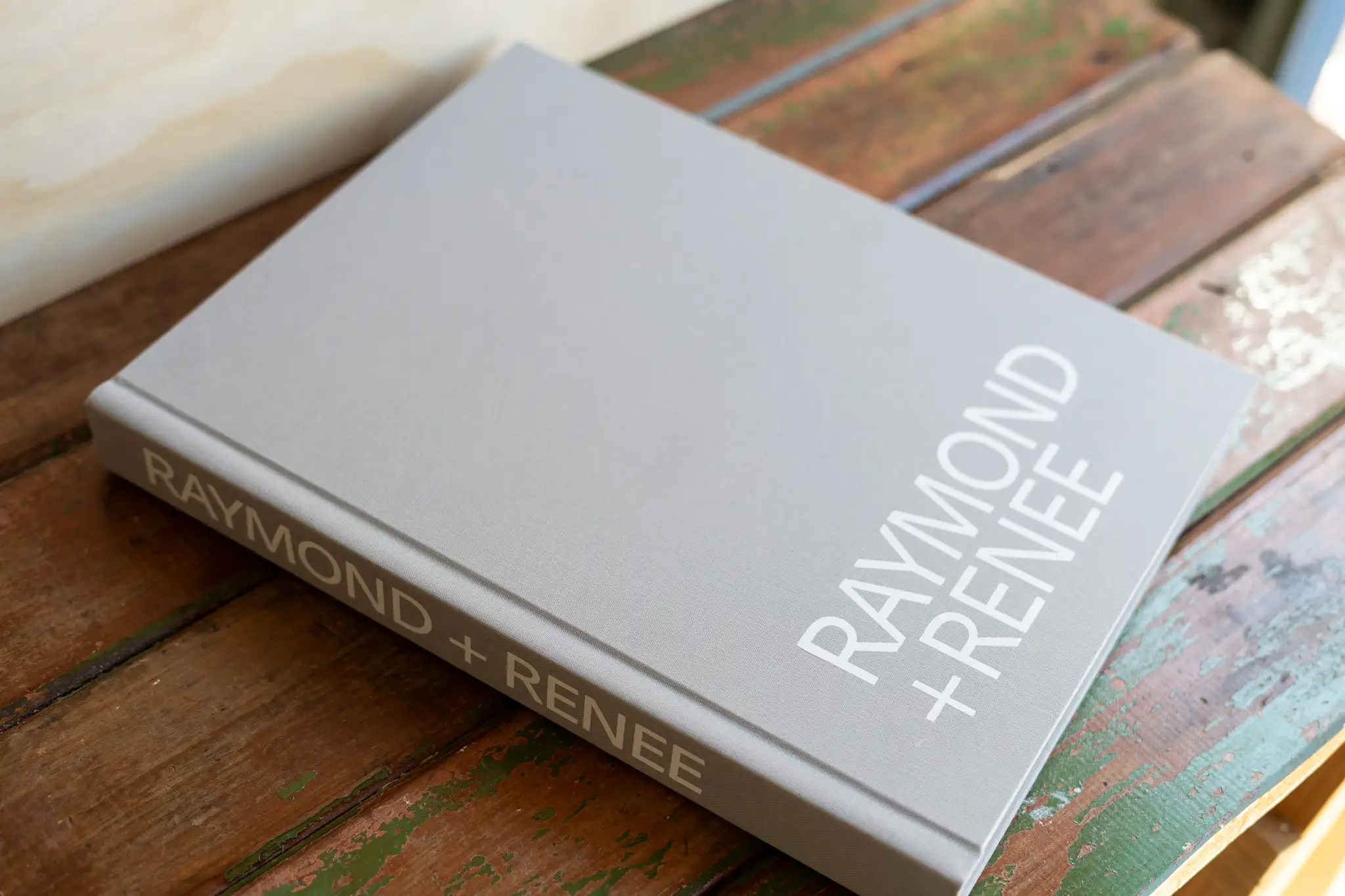
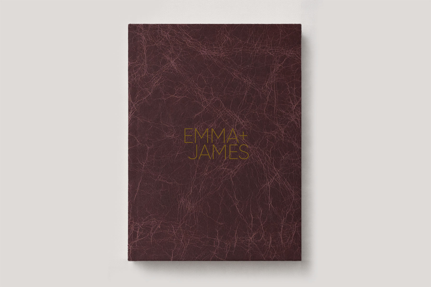
Here we present you with our best Cloud Dancer inspired wedding album covers in stunning sophisticated off-white shades. We’ve introduced some fresh cover designs using our favourite celebrity couple names as inspiration, and showcasing the designs in a variety of our colour foils that help elevate your album cover into a beautiful coffee table book.
Our take on Cloud Dancer features soft, airy, elevated neutrals and minimal designs, curated tO pair seamlessly with any aesthetic to help you wrap your wedding day celebrations and memories in an understated luxurious keepsake.
Whether you’re planning your 2026 wedding or rekindling your wedding day memories, Cloud Dancer is a great blank canvas or make a statement on its own.
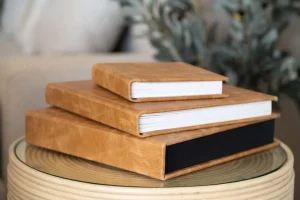
If you’re interested in exploring more Cloud Dancer aligned photo albums, some of our most popular covers already exist to fit the aesthetic beautifully.
Strike the perfect balance, off-white, white, taupe, beiges, all capture elements of the 2026 Colour of the Year dreamy, minimal mood.
Our team handpicked album covers from across the entire catalog and curated them into one Cloud Dancer collection.
It’s the easiest colour to keep your wedding album cohesive while sitting on your coffee table and feeling part of your home interiors.