While the off-white of Cloud Dancer is a calming thought in turbulent times, it doesn’t align with where design culture is actually headed.
Whether it’s a major brand’s ad campaign, walking the Paris runway, decor in the modern home, or visual research, every signal points toward the opposite — colour is what we need in 2026 or more to the point, weddings need colour in 2026.
After several years of minimalism, tame palettes and soft neutrals, people are craving colour, vibrancy, and visual presence.
Colour in 2026 is emotional, confident, intentional and about showing one’s personality.
Cloud Dancer may soothe the soul, but the market is responding to bold colours that provoke curiosity and demand attention. People are craving more than a slightly calming presence.
So, we are giving you something to set your souls and memories on fire (figuratively only) — colourful wedding album covers.
We have been keeping an eye on Pinterest Predicts and Instagram trends, watching what colour and design authorities are predicting for the year ahead and we’ve put together a few colours that better represent the year ahead.
Not in opposition to Pantone’s selection as their is always room for a peaceful off-white (especially in the world of modern romance and weddings), with that said, the colours we’ve chosen all pair exceptionally well with Cloud Dancer.
Colour is a reminder that the future isn’t monochrome — colour needs a platform to say something and we couldn’t think of a better place than a bold keepsake on your coffee table.
Weddings in 2026 are getting bolder. We are seeing more colour. More daring choices. Less of the classic white weddings and more concepts that rely on and embrace COLOUR.
Embrace colour — be bold, be unapologetic!
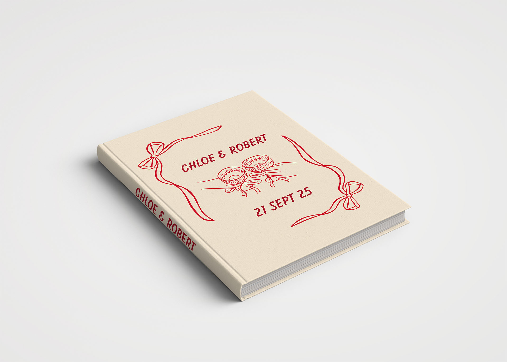
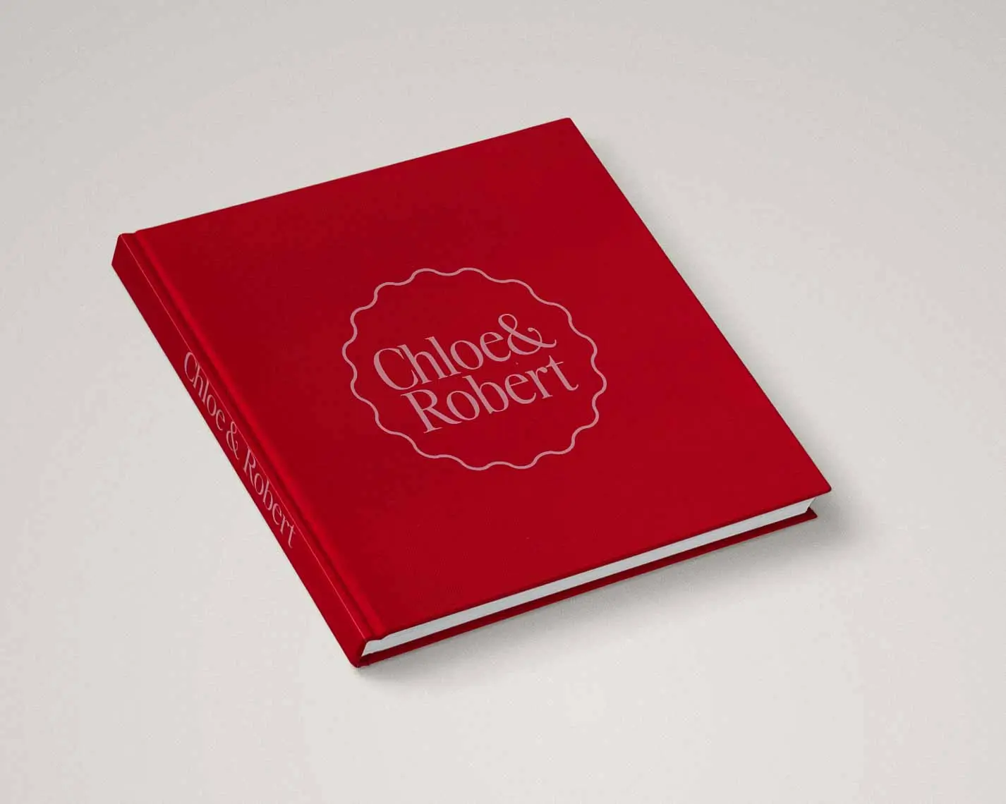
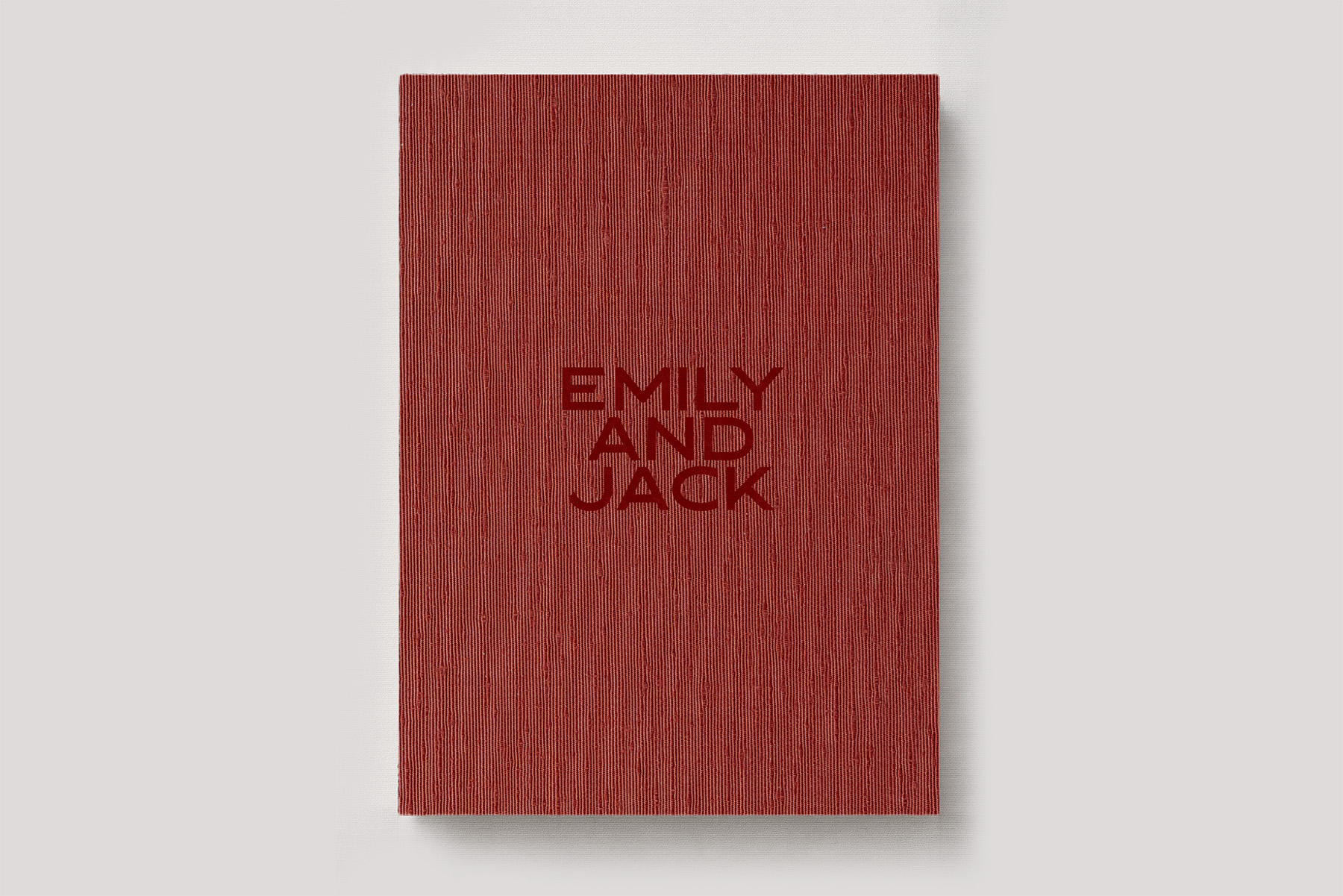
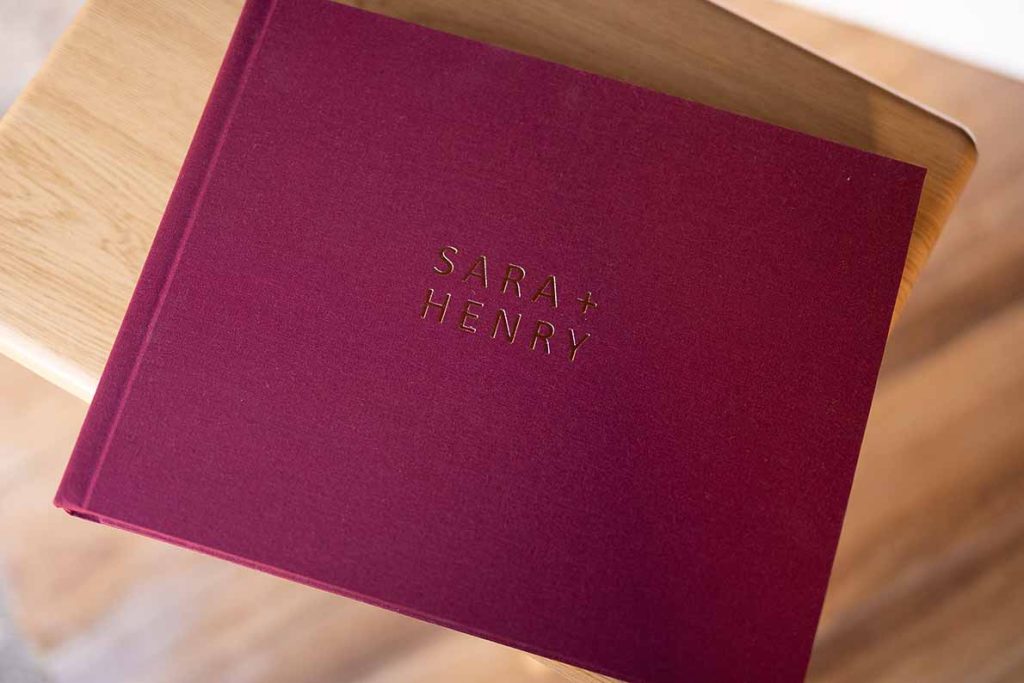
Eye-catching Reds
Red is returning in force. Red has always been a colour that best illustrates love, passion and romance. It cuts through and speaks to something primal the eye can’t ignore.
These reds create mood, passion, and richness, ideal for modern couples who want colour to act as narrative, not solely accent.
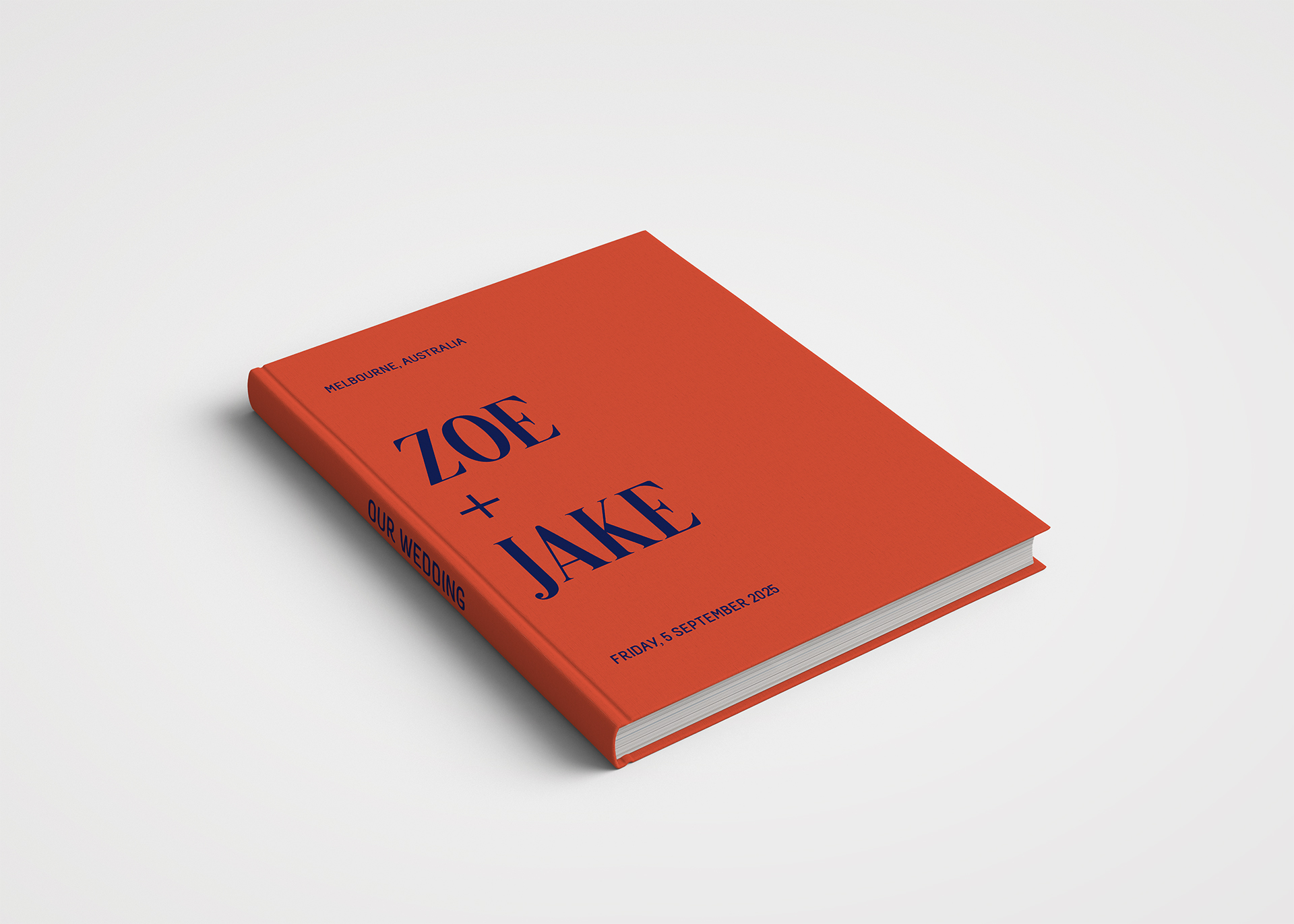
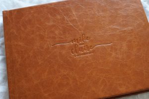
Orange Revival
Orange has skirted the edges of taste for decades: either loath or love it. It’s iconically ‘70s, resurfacing in the late 90s/early 2000s, and now ready for a cultural comeback.
Orange shifts toward warmth and energy or when deepened to earthy terracotta. It evokes brightness and positivity.
Orange is a colour that nicely pairs with blue or whites like Cloud Dancer.
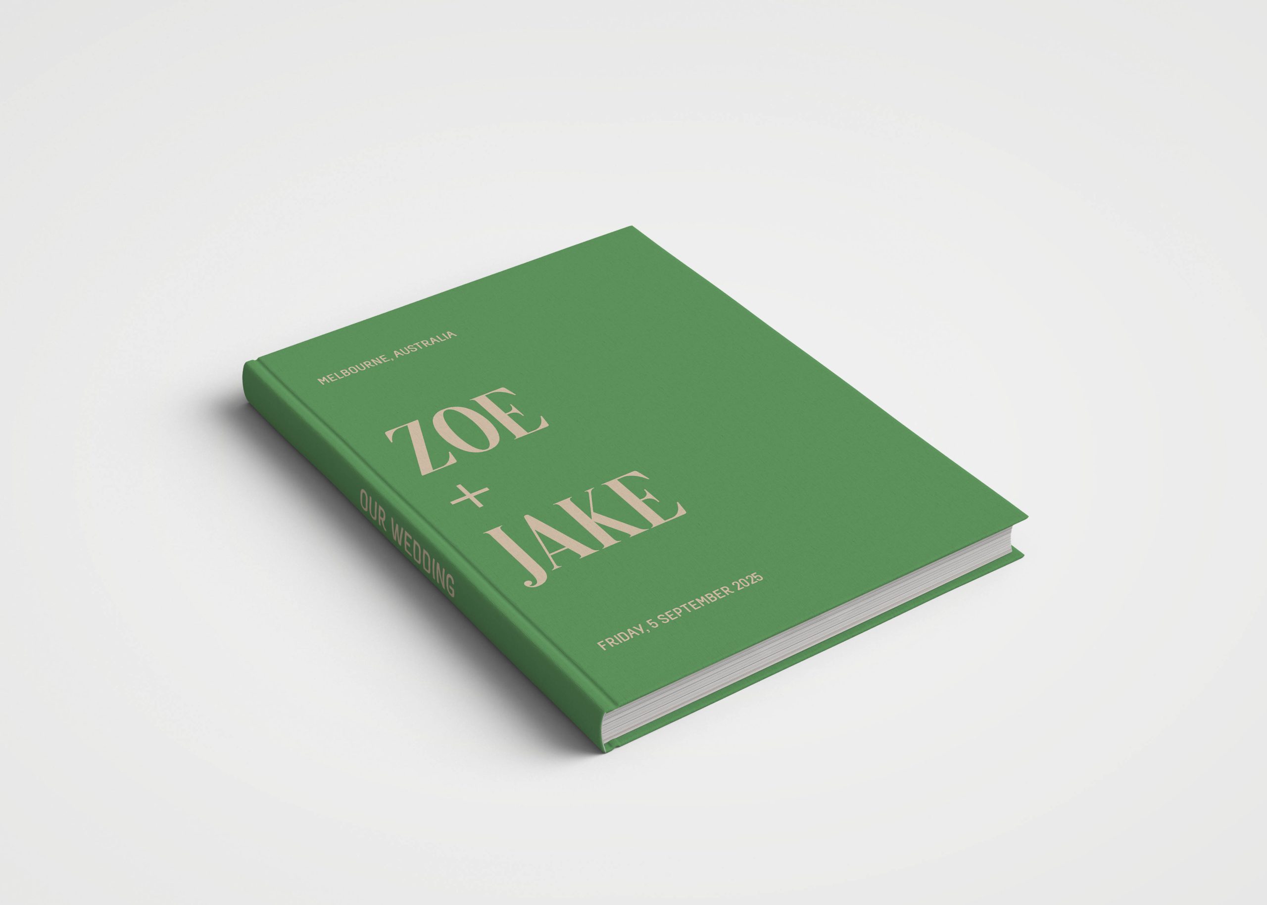
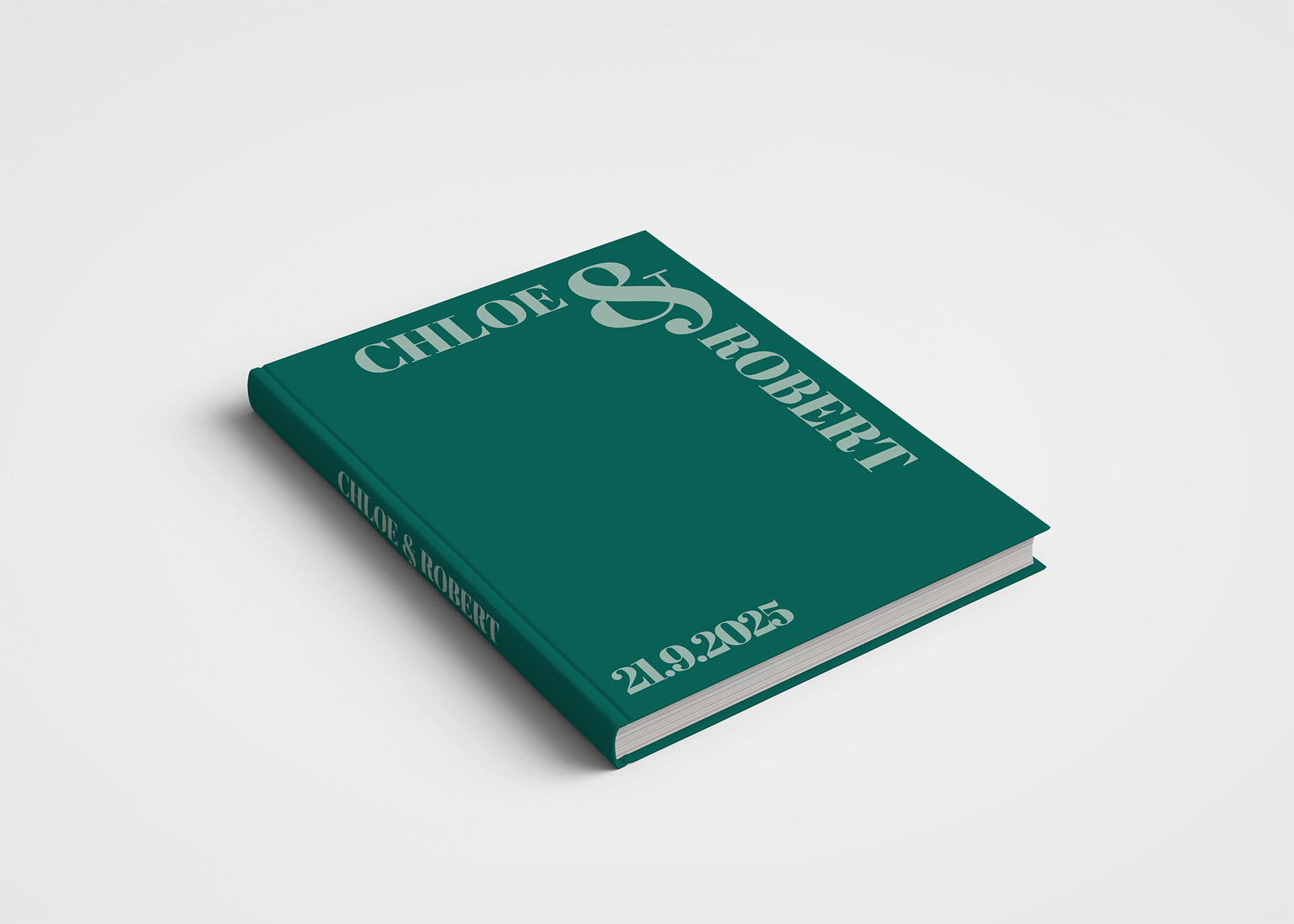
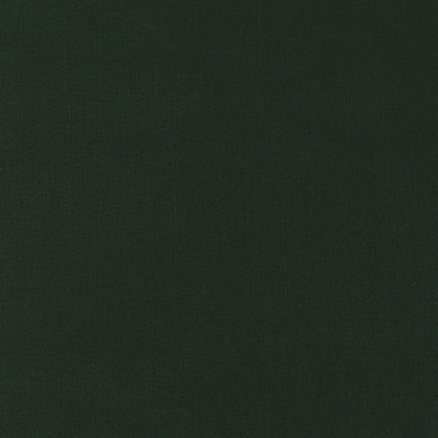
Timeless Green
Green never leaves the conversation, and this year it cooler.
There’s something regal yet refreshing because of its relationship to the world of nature. It feels natural, and serves as a reminder that sometimes it’s about returning to something timeless.
After a decade dominated by neutral aesthetics and minimalist white, the pendulum is moving toward bolder colours and aesthetics that make us feel something.
Cloud Dancer has proven its not to dominate but a supporting colour, the breather between spaces and a blank canvas to start.
Whether you are behind Pantone’s Cloud Dancer as Colour of the Year or not, 2026 isn’t the year for playing it safe with neutral palettes. Colour lovers your time has arrived.