The Swoon-worthy Wedding Magazine You Will Fall In Love With
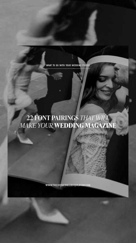
22 FONT PAIRINGS THAT WILL ELEVATE YOUR WEDDING MAGAZINE
When we are designing your Wedding Magazine, the font pairing is super important. Not only that the fonts suit the style of your wedding, but how we use fonts and where we use them.
Fonts can significantly impact the readability and overall aesthetic of your wedding magazine design.
As someone who is obsessed with typefaces, choosing the fonts for each wedding magazine design is one of my all-time favourite parts of the design process.
Exploring new font pairings and finding some really fun results or simply choosing from our Font Kit Collection. After all, the font kit includes some of our all-time favourite fonts, so I often find myself regularly reverting to these font pairings.
We are confident you will fall in love with our wedding magazine.

Firstly, what different kinds of fonts are there? For now, let’s start with the easy 4 main styles of fonts.
SANS SERIF FONTS
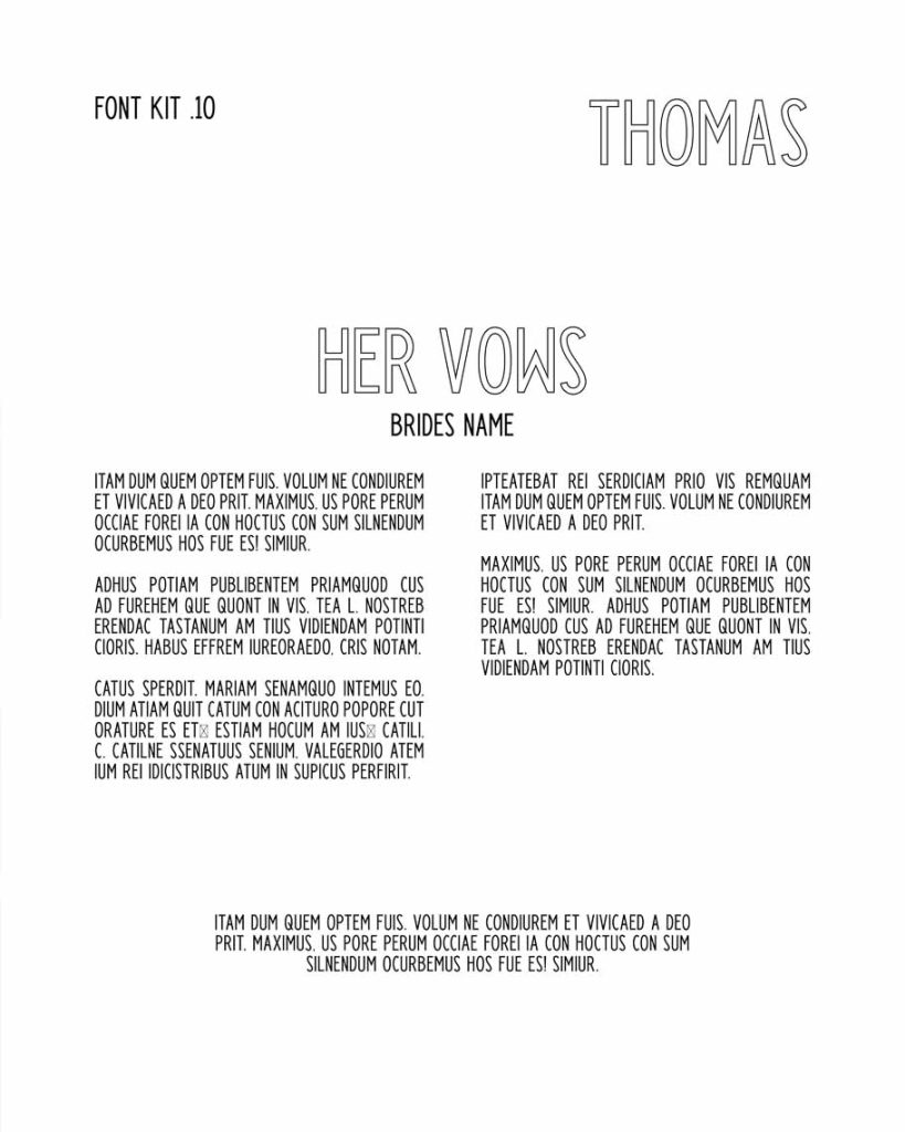
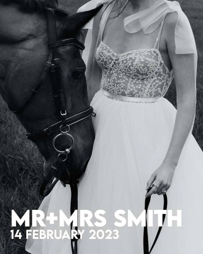
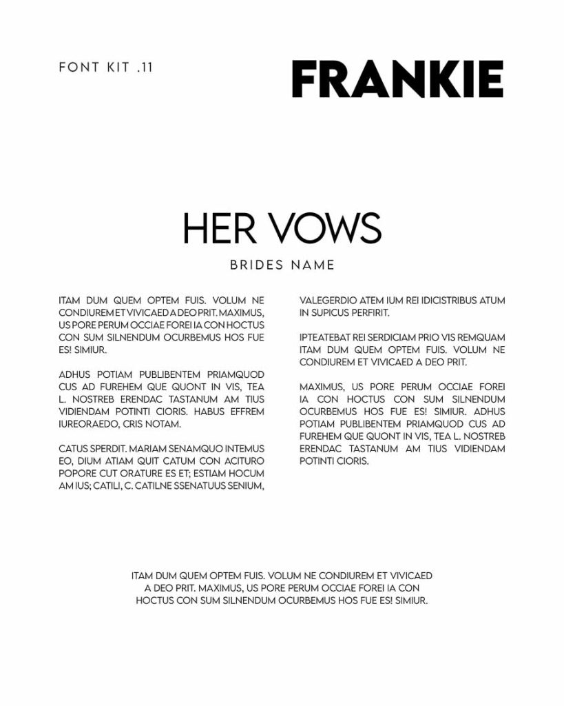
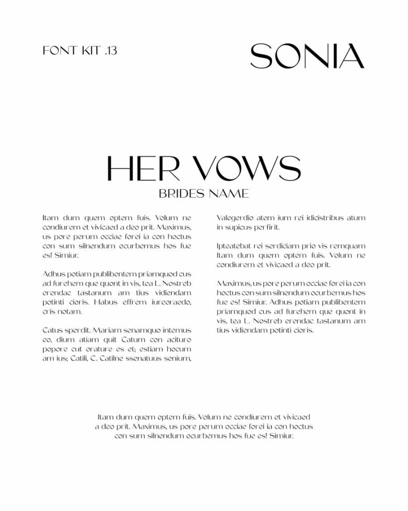
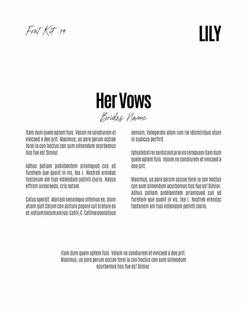
Sans Serif fonts have a clean & modern appearance, popular for a minimalist feel and perfect for contemporary weddings.
- Tip for spotting a Sans Serif font — “Sans” means ‘without’ in French, and as the name suggests, sans serif fonts lack those decorative lines or serifs at the ends of characters. Fonts like Helvetica & Arial are two commonly used sans serif typefaces.
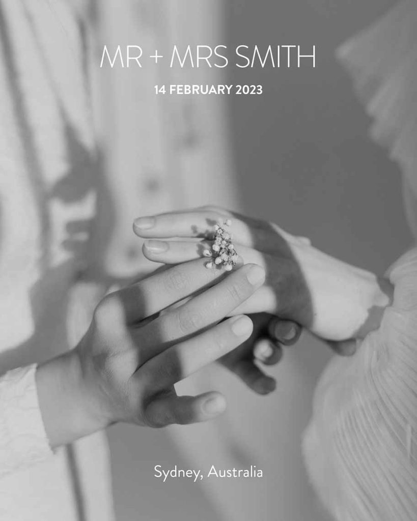

SERIF FONTS
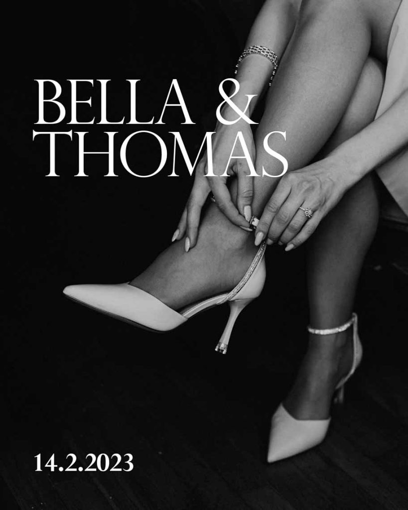
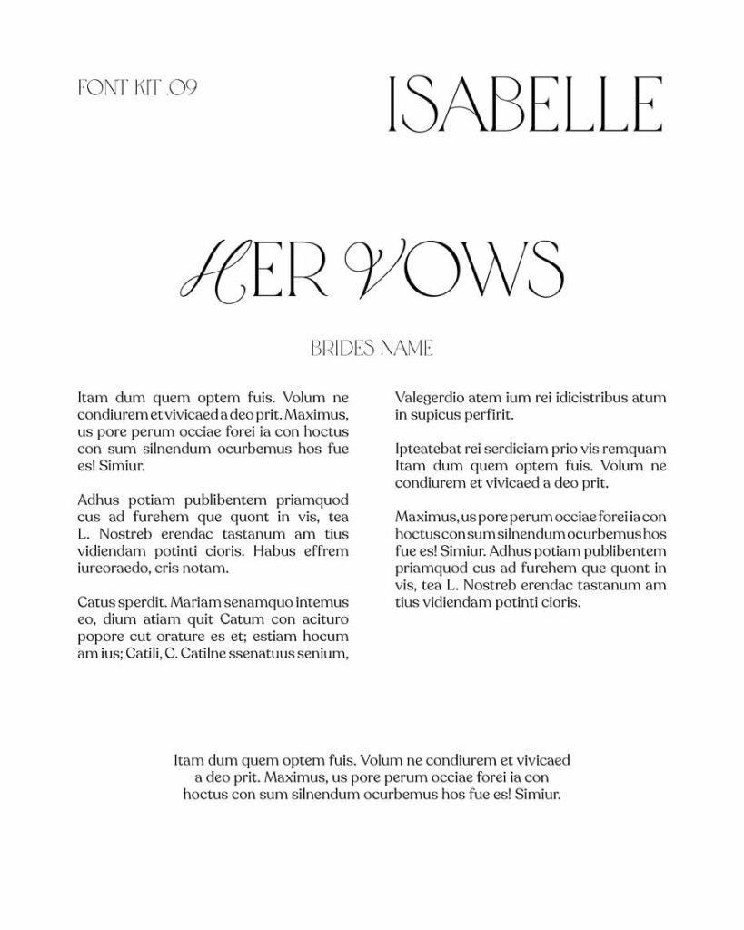
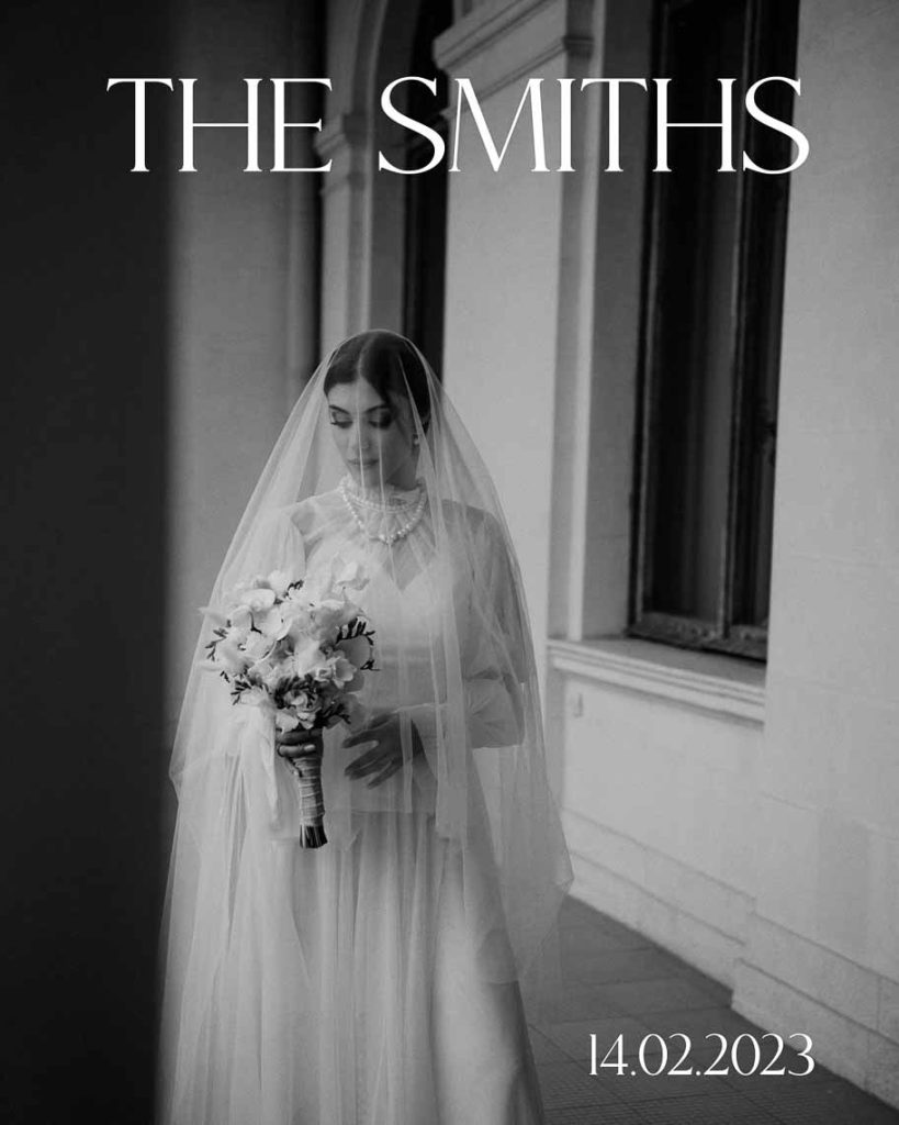
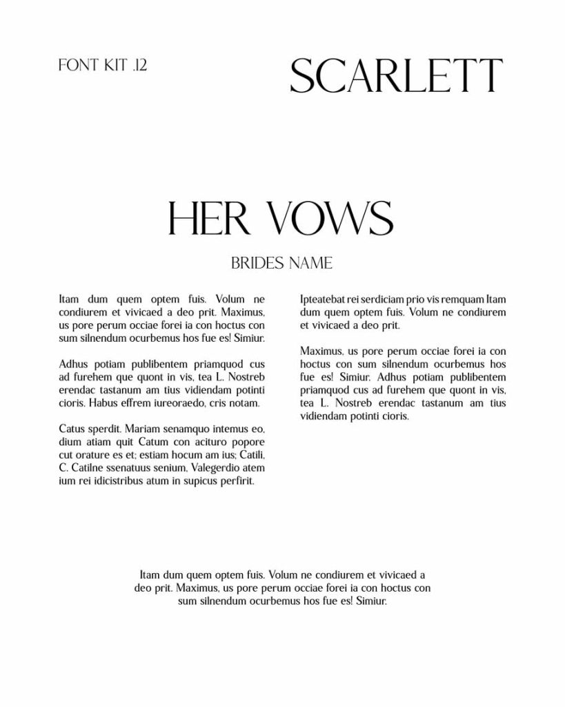
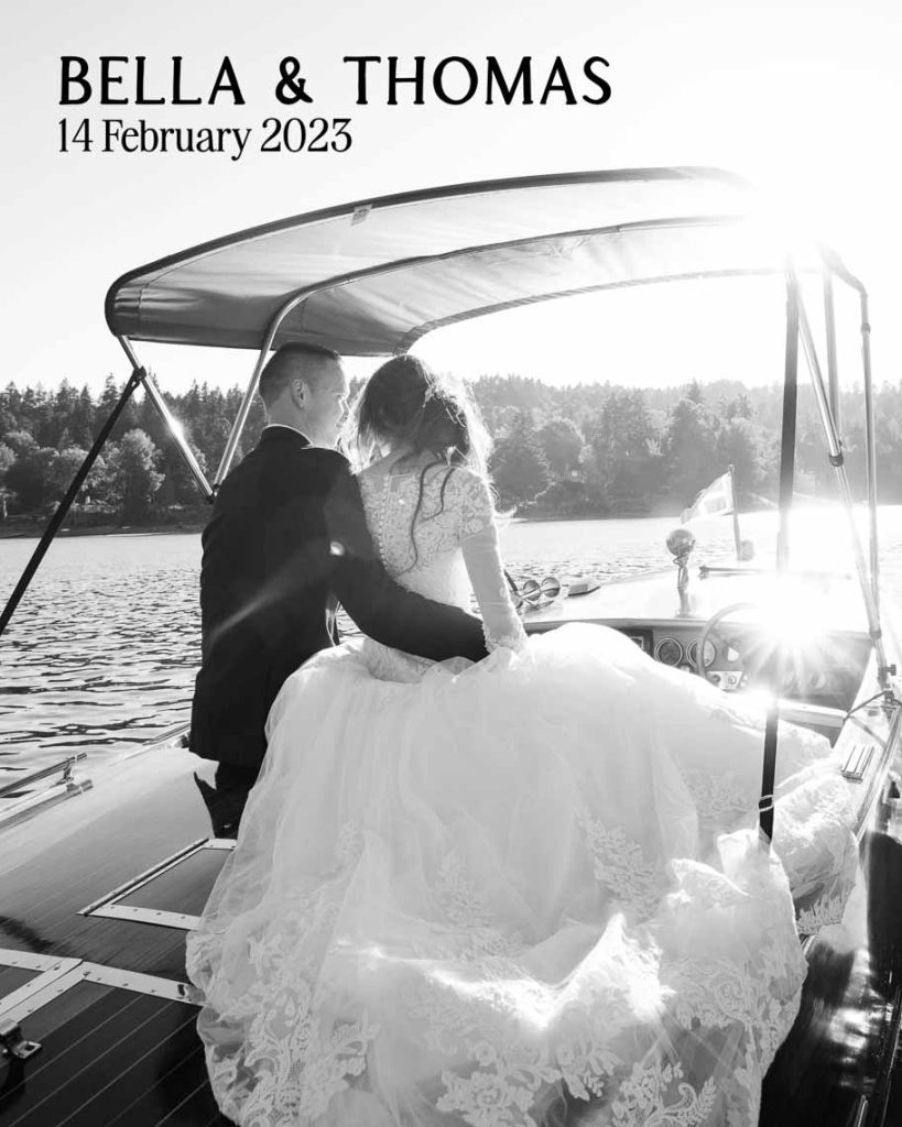
Serif fonts are timeless and elegant, often associated with nostalgia and traditional design. In the last few years serif fonts have made a resurgence as a modern editorial font inspired by fashion magazines. Appealing to classic, sophisticated and luxury weddings.
- Tip for spotting a Serif font — Serif fonts are characterised by the small decorative lines or “feet” attached to the ends of the letters. These embellishments make letters more ornate and distinctive. Fonts like Times New Roman and Garamond are two of the most popular serif fonts.
SCRIPT FONTS
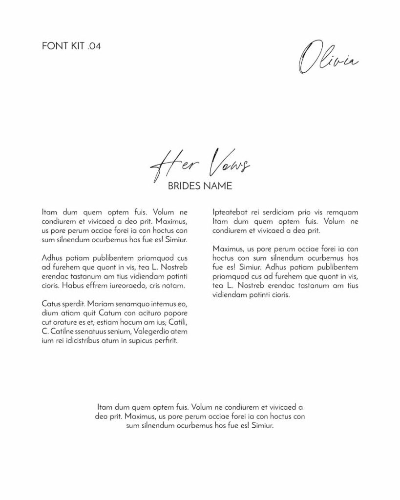
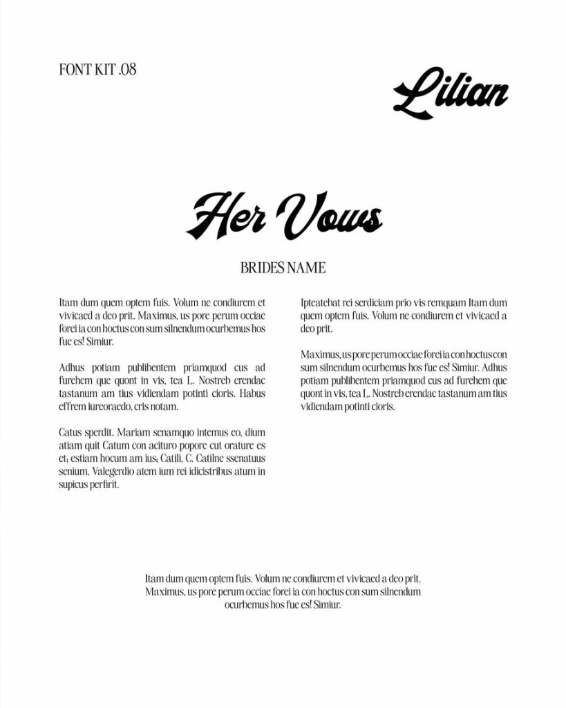
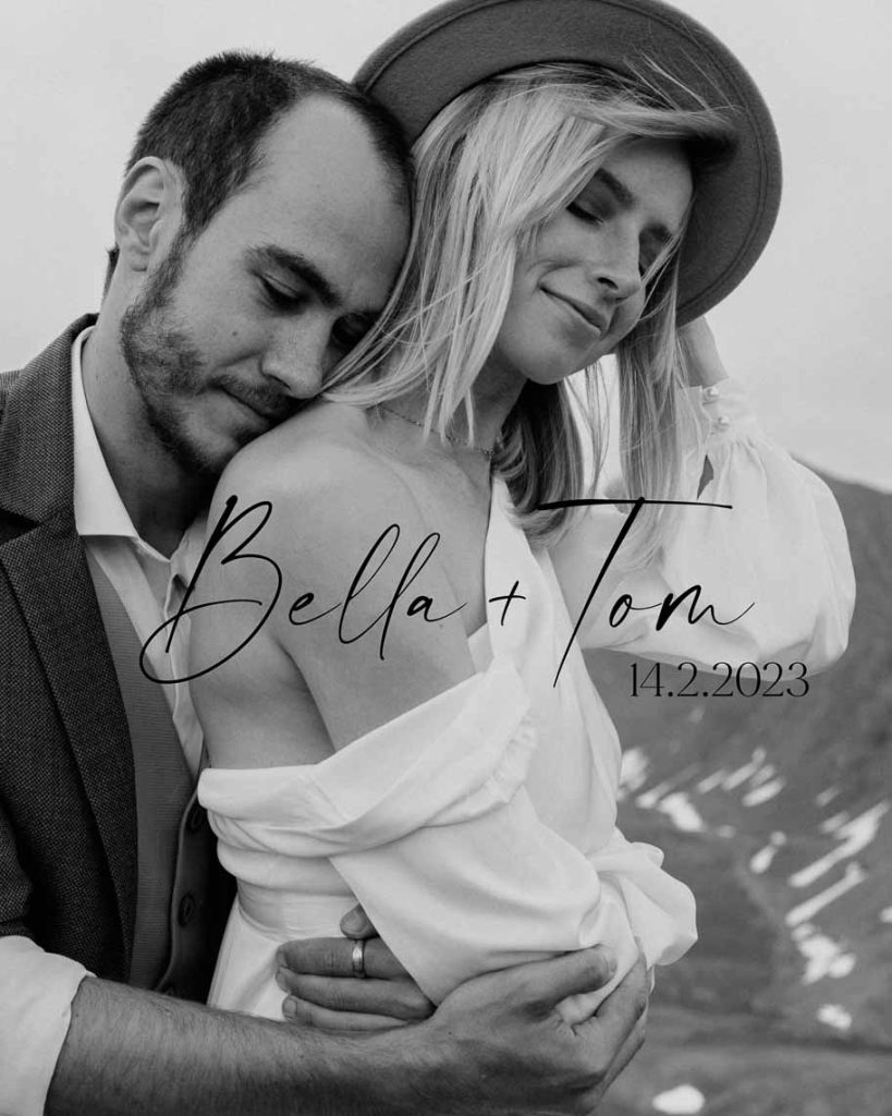
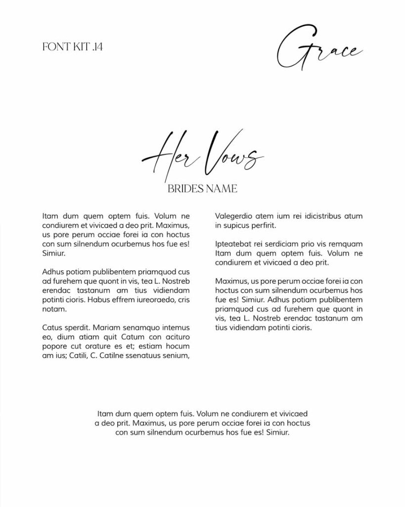
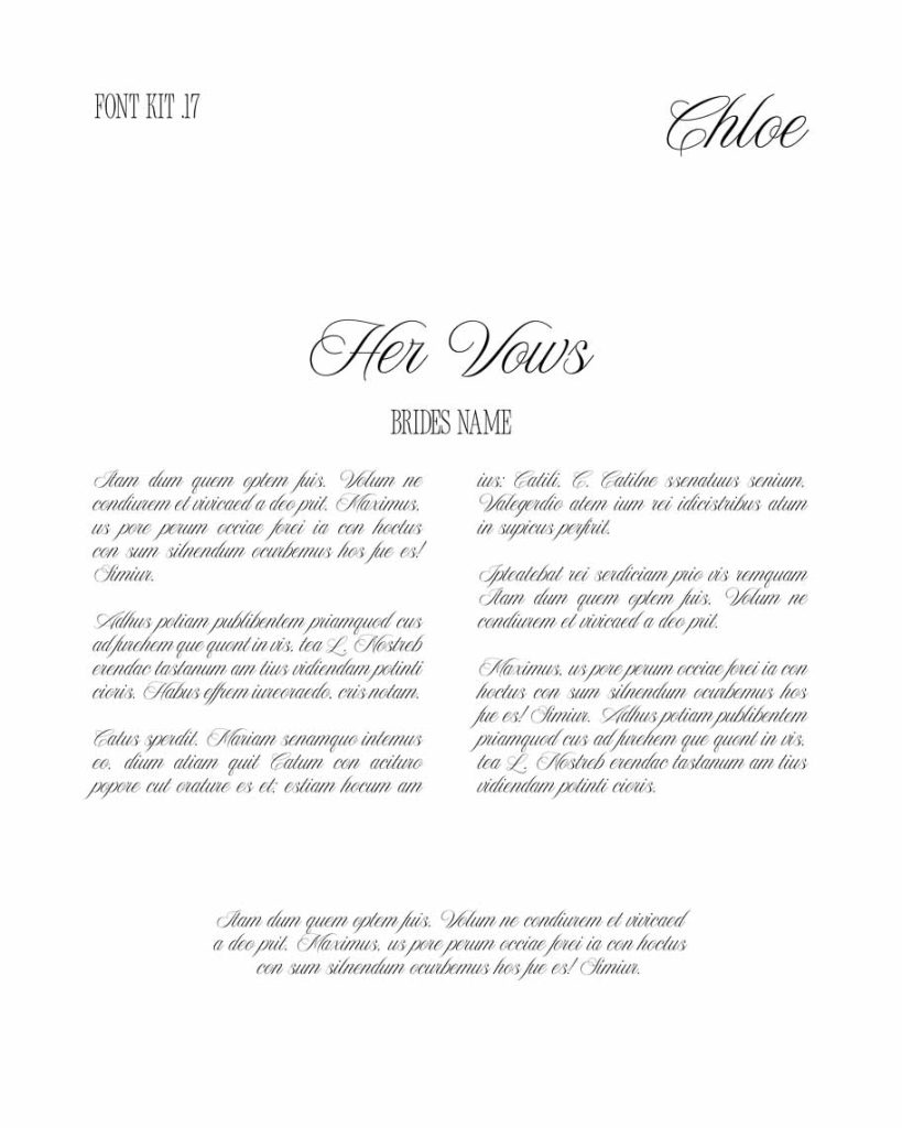
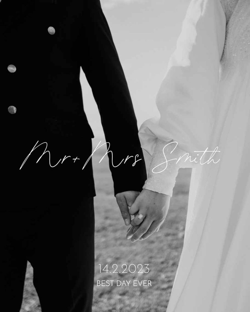
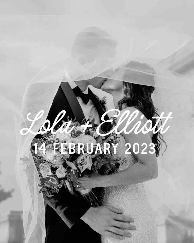
Script fonts (or cursive fonts) have a fluid motion to the lettering making them soft, feminine and romantic, even whimsical. They have a hand-drawn feel with embellishments. A natural selection when it comes to being used in the design of your wedding magazine.
- Tip for spotting a Script font — Script fonts have an organic feel with letters flowing into each other resulting in a soft romantic elegance. Calligraphy style fonts are a prime example of script fonts.
HANDWRITTEN FONTS
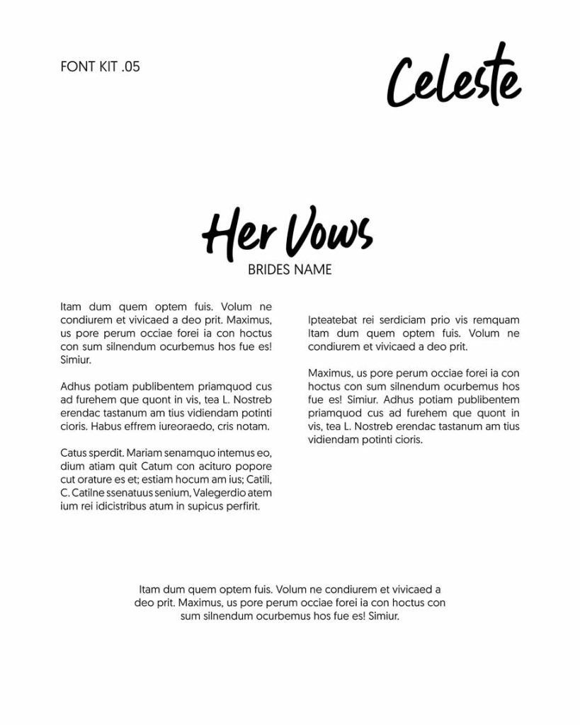
Handwritten fonts will have a brush stroke look and an authentic personal feel. Fun and casual makes the handwritten fonts great for weddings that have a more relaxed feel.
- Tip for spotting a Handwritten font — Handwritten fonts give off an authentic organic feel that are lighthearted. Fonts that look like a signature would be considerd a handwritten font.

4 Important Aspects We Consider When Pairing Fonts For A Swoon-worthy Wedding Magazine
When we were creating our Font Kits we were considering things such as:
1. Readability — is the big one!
There is no point including any text in your wedding magazine unless the font is readable and legible! Easily read fonts, for example Sans Serif and Serif fonts, encourage and aid in guiding the reader’s eye, making them an excellent choice for long-form written copy such as vows and speeches in the wedding magazine design.
You don’t want your readers to be distracted by hard to read fonts! We have carefully considered each font pairing to ensure the font is readable in terms of the font style, typeface size and weight.
For example, a fancy script font used in large bodies of text will make it hard to read, which is missing the point (right!). The aim is to entice the reader to read the story — but if its hard to read they will just skip reading the story. For body copy the best fonts are simple Sans Serif (for example Helvetica or Arial) or Serif fonts (for example Garamond).
The use of decorative script or bold sans serif fonts work well as headings, to standout and grab the readers attention and give them a quick overview of what they are about to read.
Whatever typeface we choose for the headings and paragraph copy, we ensure it’s legible at the size the magazine is printed.
In summary, either Serif or Sans Serif fonts are a great choice due to their readability in longer paragraphs. On the other hand, Serifs and fancy cursive fonts like Script and Handwritten fonts are better left for really beautiful headings, pulled quotes and aesthetically pleasing page designs.
2. Aesthetics — We are all about looking good.
Ensuring font pairings look good together is important to the overall aesthetics of your magazine design, making it more attractive and engaging to the reader.
3. Hierarchy
Fonts help establish a visual hierarchy, guiding the reader’s eye and emphasising key information. For instance, headings and more important titles tend to be bolder and bigger in comparison to paragraph text.
4. Consistency — otherwise its all just a mess (eek!)
When designing your wedding magazine its critical that we maintain a cohesive look across the internal pages of the design to the magazine cover. While we will present some magazine cover options that often include different font pairings as options, when it comes to the final design review, we will match the fonts used on your magazine cover to the ones on the internal pages or vice versa after consulting with you as to your favourite font pairing.
When choosing heading fonts to standout and help navigate the reader to create a Swoon-worthy Wedding Magazine
We look for:
- Bold lettering that stand out on the page so there is no confusing its a heading.
- Limited word usage is the key when using script and handwritten fonts in headings and where they shine. Also, script and handwritten fonts are great for pull quotes throughout the magazine.
When choosing paragraph fonts for long-form written copy for a Swoon-worthy Wedding Magazine
We look for:
- Easy to read, both in font style and size.
- Modern Sans Serif typefaces are best or Serif typewriter-style typefaces can work too.
- Differentiation and good contrast between the heading font and the body font, for example the heading font is a script, handwritten or Serif font paired with a Sans Serif font.
Let’s Explore The 22 Font Kits That Will Have You Falling In Love With Your Wedding Magazine
Choosing fonts is like looking for a needle in a hay stack — there are just so many!
This is why we have put together a collection of our favourite font pairings for our wedding magazine.
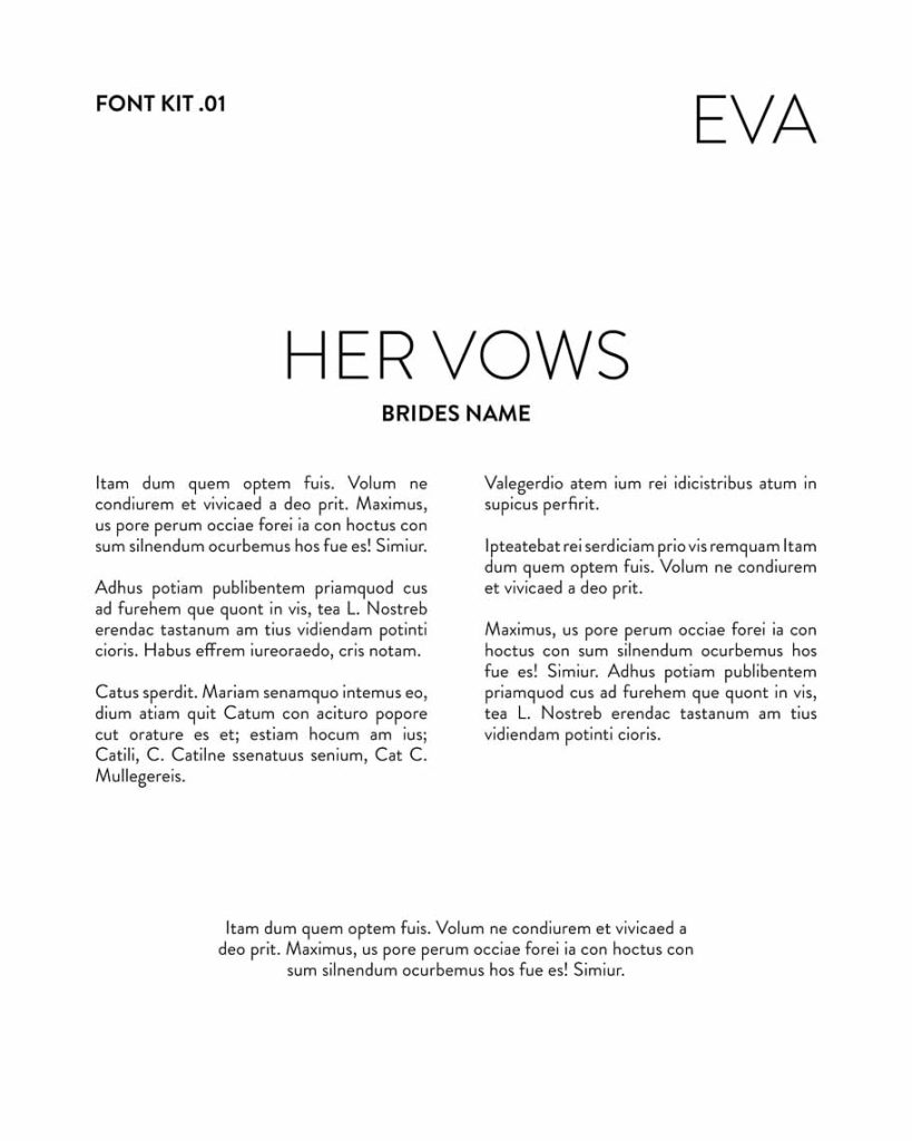
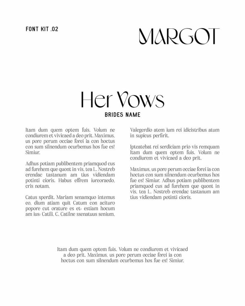
These font pairings will help guide our couples in a direction of the style they want to go with their wedding magazine photo book.
When ordering your wedding magazine, you can choose any of the font kits or our designer is happy to recommend the best font pairing from the kit for your wedding magazine design.
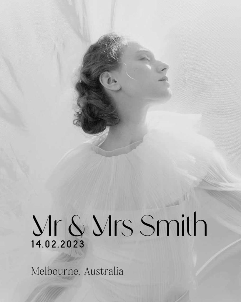
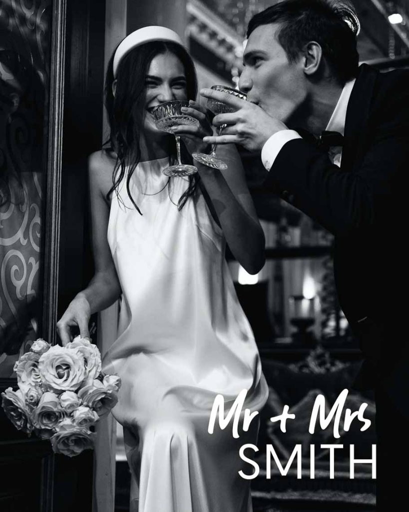
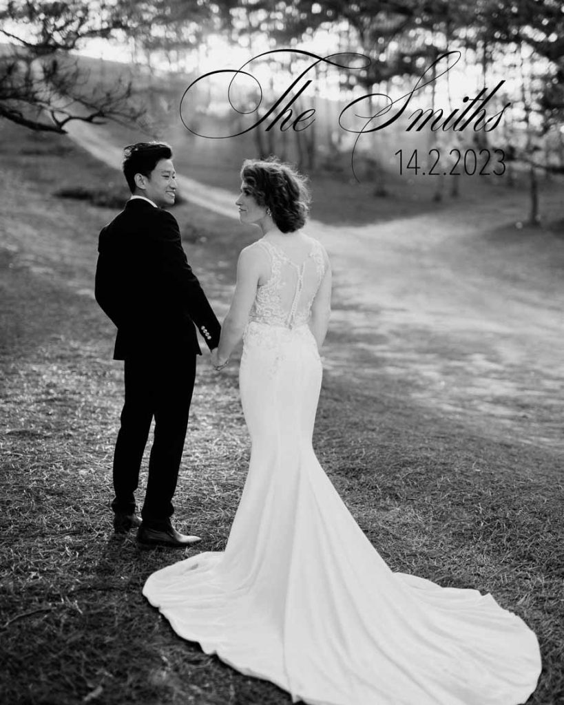
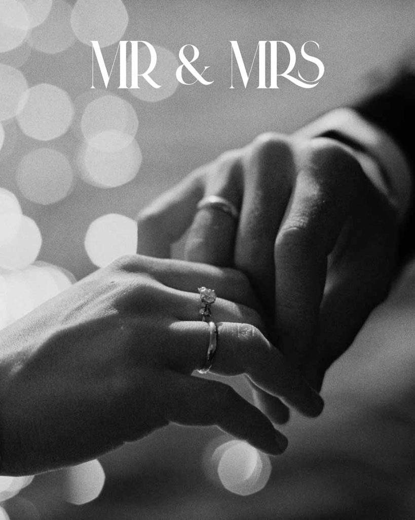
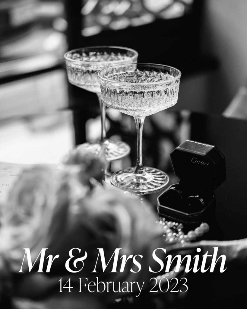
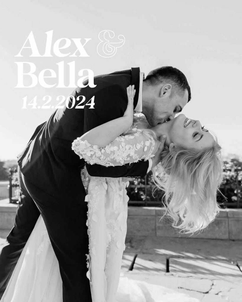
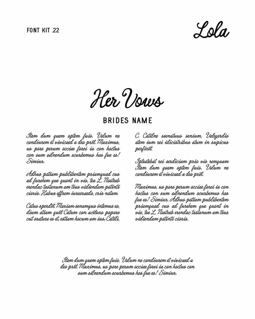
Below are 22 Font Pairings and examples of how the fonts will look on the wedding magazine cover and the use of the typefaces on an example page layout for the vows.
We are excited to use these font kit pairings in future couples designs and trust you too will fall in love with our wedding magazine.
Let's create a Swoon-worthy Wedding Magazine ...
-

Wedding Magazine — Contemporary Cover
$950.00 – $1,995.00Price range: $950.00 through $1,995.00 View Product This product has multiple variants. The options may be chosen on the product page -

Wedding Magazine — Creative Cover
$950.00 – $1,995.00Price range: $950.00 through $1,995.00 View Product This product has multiple variants. The options may be chosen on the product page -

Wedding Magazine — Creative Covers
$950.00 – $1,900.00Price range: $950.00 through $1,900.00 View Product This product has multiple variants. The options may be chosen on the product page -

Wedding Magazine — Minimalist Editorial Cover
$950.00 – $1,995.00Price range: $950.00 through $1,995.00 View Product This product has multiple variants. The options may be chosen on the product page -
Wedding Magazine — Minimalist Typography Cover with Neon Pink Ink
$950.00 – $1,995.00Price range: $950.00 through $1,995.00 View Product This product has multiple variants. The options may be chosen on the product page -

Wedding Magazine — Modern Arch Cover
$950.00 – $1,995.00Price range: $950.00 through $1,995.00 View Product This product has multiple variants. The options may be chosen on the product page -

Wedding Magazine — Modern Editorial Cover
$950.00 – $1,995.00Price range: $950.00 through $1,995.00 View Product This product has multiple variants. The options may be chosen on the product page -

Wedding Magazine, Classic Editorial Style Kit
$750.00 – $2,500.00Price range: $750.00 through $2,500.00 View Product This product has multiple variants. The options may be chosen on the product page -

Wedding Magazine, Contemporary Style Kit
$750.00 – $2,500.00Price range: $750.00 through $2,500.00 View Product This product has multiple variants. The options may be chosen on the product page -

Wedding Magazine, Fashion Editorial Style Kit
$750.00 – $2,500.00Price range: $750.00 through $2,500.00 View Product This product has multiple variants. The options may be chosen on the product page -

Wedding Magazine, Modern Style Kit
$750.00 – $2,500.00Price range: $750.00 through $2,500.00 View Product This product has multiple variants. The options may be chosen on the product page -

Wedding Magazine, Modern Style Kit — Desert Colours
$750.00 – $2,500.00Price range: $750.00 through $2,500.00 View Product This product has multiple variants. The options may be chosen on the product page -

Wedding Magazine, Modern Style Kit — Forest Colours
$750.00 – $2,500.00Price range: $750.00 through $2,500.00 View Product This product has multiple variants. The options may be chosen on the product page -

Wedding Magazine, Modern Style Kit — Gelato Colours
$750.00 – $2,500.00Price range: $750.00 through $2,500.00 View Product This product has multiple variants. The options may be chosen on the product page -

Wedding Magazine, Modern Style Kit — Peachy Colours
$750.00 – $2,500.00Price range: $750.00 through $2,500.00 View Product This product has multiple variants. The options may be chosen on the product page -

Wedding Magazine, Modern Style Kit — Spicy Colours
$750.00 – $2,500.00Price range: $750.00 through $2,500.00 View Product This product has multiple variants. The options may be chosen on the product page

